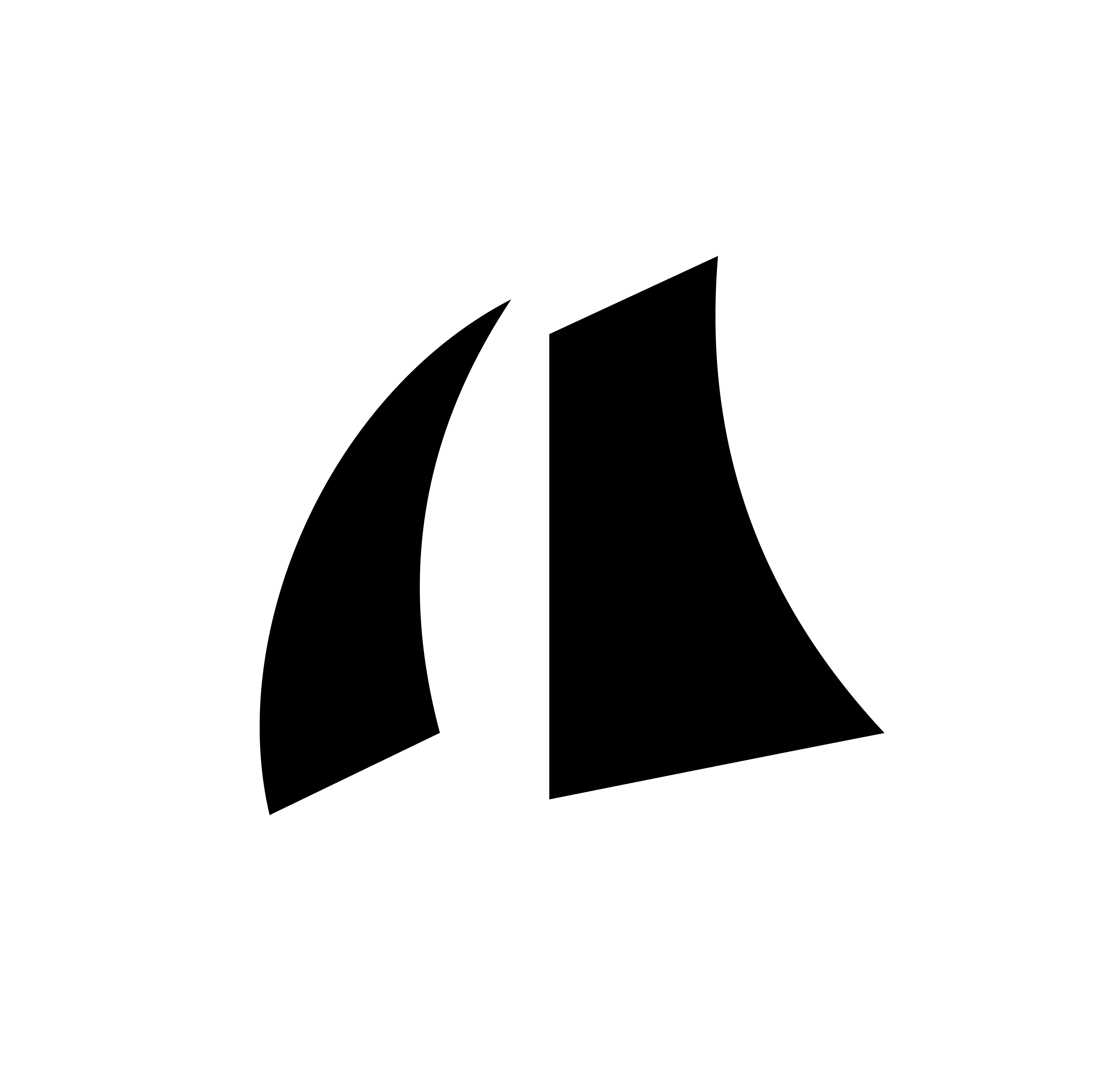
Logo
The logo is the most immediate expression of Armada's strength and permanence. It communicates trust and scale before a single word is read.

Always maintain a minimum clear space equal to the height of the sail symbol on all four sides of the logo. This space must be free of other text, graphics, and visual elements. When in doubt, give it more room.
Use solid white on dark backgrounds. Use solid black on light backgrounds. Never compromise legibility.
Do not stretch, warp, rotate, recolor, add drop shadows, or apply effects to the logo.
Maintain clear space equal to the height of the sail symbol on all sides.
Do not recreate the logo by hand, from memory, or using AI tools. Always use approved source files.
Always use approved logo files from the asset library. Contact the Growth Team if you need a new format.
Do not place the logo on busy photography, low-contrast backgrounds, or on other brand colors.